• Follow us on Twitter @buckeyeplanet and @bp_recruiting, like us on Facebook! Enjoy a post or article, recommend it to others! BP is only as strong as its community, and we only promote by word of mouth, so share away!
  • Consider registering! Fewer and higher quality ads, no emails you don't want, access to all the forums, download game torrents, private messages, polls, Sportsbook, etc. Even if you just want to lurk, there are a lot of good reasons to register!

Ohio State University to have new logos

ORD_Buckeye;2300613; said:
Nobody has brought this up, but I dig its style. I'd streamline it a bit though. Use a sleeker, cleaner font. Go for that whole Jetsons-Eames-Draper-Sinatra mid-century thing.

osuacadjpg-5eed18885a46a326.jpg

Depending on what the usage guide actually requires, that one is going to be a pain to integrate into the colleges' websites. If it is just for printed material it should be fine, though.

some current banner examples:
fisher-logo-white.png

ehe-logo.png

logo-nursing.png
 
Upvote 0
Ohio State updates athletic logo, ruins everything

Do not adjust your monitor. That horrible monstrosity you see at the top of the page is merely one of the worst visual identity changes in recent collegiate athletic (re)branding history. Following the creatively blind vision of the University of California system, Ohio State has confirmed that more often than not, from a creative sense anyways, less is not more. In a report by Karen Farkas of The Cleveland Plain Dealer, Ohio State unveiled a number of new identities Monday morning, the absolute worst being their new athletic logo.

.../cont/...

Even SI had something to say...

Ohio State rebranding poisons Buckeye sentiment

We put a lot of work into that headline. Be nice. Here is Ohio State’s new logo, to your right. Can you spot the changes? Do you like them? IF YOU DO YOU ARE WRONG AND GROSS:

Though Ohio State could’ve gone any number of directions with the new logo, they instead effectively rendered an end result that looks something like an Adobe Photoshop CS6 mistake from a first time attendee at a design camp. The biproduct is a mark that’s unreadable at best, and appears to the naked eye as “O-S-E hio-tat” (tattoos? Get it?). While the minds behind the creative decision could’ve properly kerned the logo, instead they elected to take the easy way out and completely punt on crafting the typography.
 
Last edited:
Upvote 0
Muck;2302901; said:

While I don't claim to know everything, I do work in marketing for a Fortune 10 company. I sent an email to Gene and a communications director and I received something back from another person at the university.

In the end, they aren't going to change. It's a shame; now that SI has piled on you'd think they would know how bad this logo looks. But two things did catch my eyes in the response:

  • The direction of the Athletics mark is to optimize for digital use.
  • Refinements to the mark continue... with the help of the original designer.
In addition, they took the angle that the response by me and by the public at large means they should be better at communicating. While I do agree with that, when you consider the defense for the new direction of the logo is 'digital use', it means they are missing the point. This logo isn't good and no one will admit it.
 
Last edited:
Upvote 0
OSU_D/;2303212; said:
[*]The direction of the Athletics mark is to optimize for digital use.

So the previous logo with its narrow inline has been fine since we were all discovering the Internet with 486s and 640x480 monitors, but now that we're entering the age of Retina displays and televisions that pull 4320 lines of resolution we need a chunkier three color graphic?

Horseshit.
 
Upvote 0
OSU_D/;2303212; said:
In the end, they aren't going to change.

Yet another reason to shitcan Gene Smith...the arrogant fuck won't even admit they made a huge fuckup. He's basically saying "I don't give shit how many of you complain, I ain't changing it solely because I choose not to."
 
Upvote 0
OSU_D/;2303212; said:
In addition, they took the angle that the response by me and by the public at large means they should be better at communicating.

That's like something you'd hear from GM at it's worst...

"The reason we are not selling more Pontiac Azteks is because we did not properly communicate it's appeal to the public."
 
Last edited:
Upvote 0
Dear Ohio State, With Love?

.../snip/...

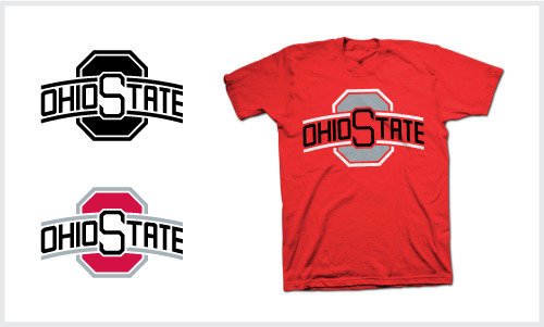
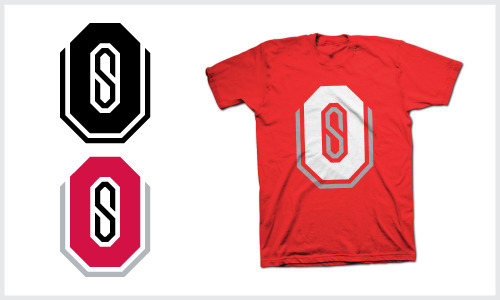
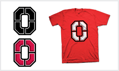
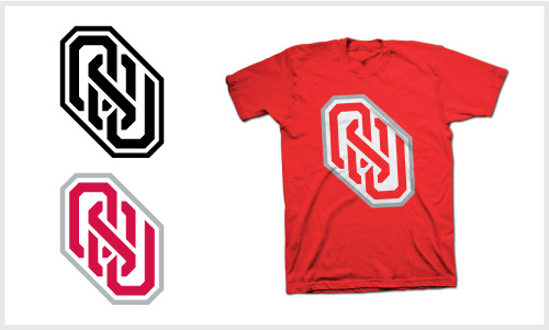
For those that can?t spot the difference, essentially they filled in all the gaps in ?OHIO STATE?, leaving all the letterforms inconsistent and pretty appalling. I?d expect most non-designers to issue a ?who cares?, but the minute I laid eyes on that I was really disappointed. It?s not even worth the update, and just comes off lazy. So I decided to go home, grab some grid paper, and then sketch up a few marks that I?m 100% convinced are more logical and aesthetically pleasing solutions. I obviously don?t expect the administration to give a crap about what I or anyone else thinks, but if they stumble upon this, please pray for a change of heart.

.../cont/...

tumblr_inline_mhxoadXQsv1qz4rgp.jpg

tumblr_inline_mhxonmsi0O1qz4rgp.jpg

tumblr_inline_mhxoznqZmk1qz4rgp.jpg

tumblr_inline_mhxpjoLE0B1qz4rgp.jpg

tumblr_inline_mhxpzk43el1qz4rgp.jpg


In the link he also explains his decision making process on the various designs.

I like the first design the best and while I don't think it's quite 'there', it's definitely on the right path.

The others are kinda cool but much better suited for fun 'fan' t-shirts rather than the official logo for the team.
 
Upvote 0
Muck;2303884; said:
Dear Ohio State, With Love?


tumblr_inline_mhxoadXQsv1qz4rgp.jpg

tumblr_inline_mhxonmsi0O1qz4rgp.jpg

tumblr_inline_mhxoznqZmk1qz4rgp.jpg

tumblr_inline_mhxpjoLE0B1qz4rgp.jpg

tumblr_inline_mhxpzk43el1qz4rgp.jpg


In the link he also explains his decision making process on the various designs.

I like the first design the best and while I don't think it's quite 'there', it's definitely on the right path.

The others are kinda cool but much better suited for fun 'fan' t-shirts rather than the official logo for the team.


The first one I'd be okay with having as the official logo. The second one is terrible, third one is meh, fourth would be okay as an unofficial logo, fifth is horrible.

The second and fifth are worse than what the university came up with, and none of them are better than what we had.
 
Upvote 0
Now that a full week has passed since this news broke and everybody has had an opportunity to see the new logo and let it sink in, my unscientific study of various Internet forums, sites, and articles leads me to conclude that a grand total of maybe three or four people worldwide approve of this change.

When the reception for your rebranding is a bigger failure than the B1G division names, you've really pulled off something special.
 
Upvote 0
Back
Top