


I don't like what Nike is doing to a majority of the uniforms, but i've always said I think Oregon is a very smart squad to allow such ugly uniforms.
Their uniforms are so ugly it puts them on the map, and gives them some attention that they otherwise would never see.
There is no such thing as bad press; in the form of image.
Their uniforms are so ugly it puts them on the map, and gives them some attention that they otherwise would never see.
There is no such thing as bad press; in the form of image.
Upvote
0

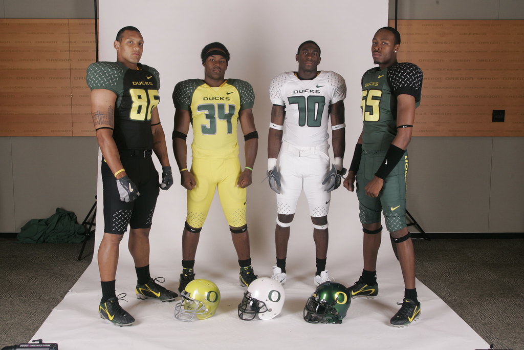
 I remember even ESPN doing a segment on Oregon's uniforms a couple years ago.